Colour is never just colour. It sets the temperature of a painting, shifts the mood, defines the space between forms. The Cass Art Artists’ range is built around that understanding. Strong, reliable pigments. Clean mixing. Consistent handling across the palette. These are colours made to be worked — whether you’re blocking in quickly, building up layers, or pushing into fine detail. In this blog, we’re taking a closer look at the range: how the colours behave, how they sit alongside one another, and how to build a palette that genuinely supports the way you paint.

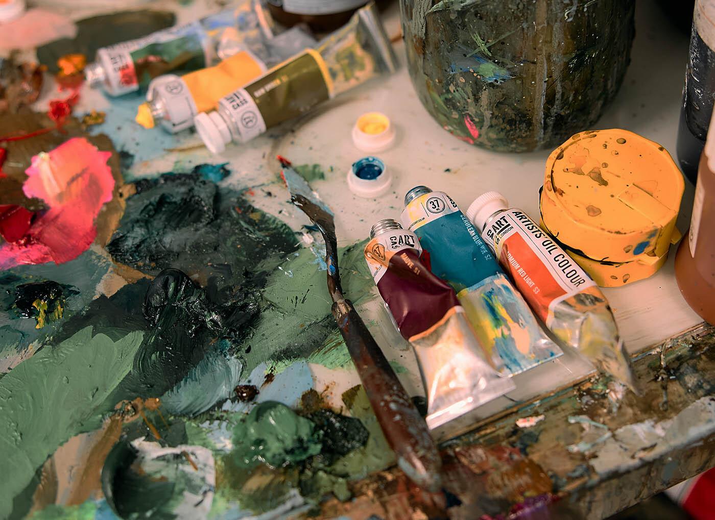
The strength of any palette is in its balance. Ours is built around dependable core colours — the earths, the essential primaries, the whites you’ll reach for daily — alongside more distinctive, characterful hues that shift a painting into new territory. Each colour is selected for clarity and mixing strength, so you’re not fighting muddy results or compensating for weak tinting power. What you put down is what you get.
Handling matters just as much as hue. These colours are formulated for a consistent, workable body across the range, so whether you’re painting alla prima or building slowly through layers, they respond in a predictable way. They hold their own in mixes, carry across surfaces with confidence, and give you the control to push from broad gestures into refined passages without changing paint halfway through.
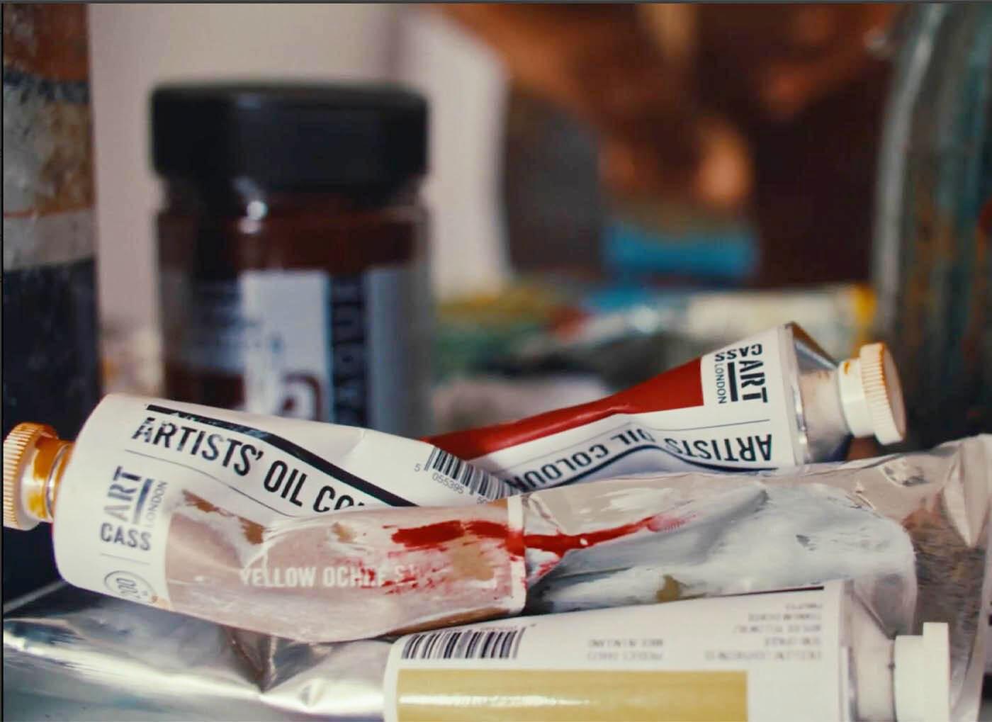
Consistent Quality: Every tube of Cass Art oil paint is rigorously tested to guarantee consistent performance and reliability. This means that you can trust that each tube of paint will meet the same high standards of quality, regardless of when it was purchased or where it was manufactured.
Affordability without Compromise: We believe that high-quality art supplies should be accessible to all artists. Our new oil colours offer exceptional value without compromising on quality. This means that you can enjoy the benefits of professional-grade pigments and smooth application without breaking the bank.
For those working larger — or simply working often — selected colours are now available in 200ml. It’s a straightforward shift that makes a real difference in the studio. When a colour becomes central to your palette, the last thing you want is to run out mid-passage. Larger tubes mean fewer pauses, fewer repeat orders, and more continuity in your process.
The 200ml size also changes how you use paint. There’s a freedom in knowing you can mix generously, build weight into a ground, or return again and again to a single tone without hesitation. Titanium White that carries a painting. A blue you rely on for depth. Earth colours you move through steadily. When the volume matches the way you work, the material stops feeling precious and starts doing its job.
It’s a practical addition, but one rooted in how artists actually paint. Committing to larger sizes isn’t about excess — it’s about rhythm. Keeping momentum. Letting the work develop without interruption.
Paint should support the scale of your ideas. The 200ml range is there for exactly that reason...

In the end, colour should feel dependable. It should mix cleanly, behave consistently and hold up over time — not distract you from the work itself. The Cass Art Artists’ range is built to do exactly that: practical, considered colour designed to support serious painting, whether you’re refining a small study or committing to something much larger.
Add To List
Add a Wishlist
form to add wishlist here