Golden Ochre: Colour of 2016
Posted by Cass Art on 1st Mar 2018
It's the colour of the 2016 - the stunningly warm shade of yellow-gold. Golden Ochre has been named colour of the year by Colour Futures, AkzoNobel, and our newest tote bag, Golden Ochre, matches the golden hype.
Golden Ochre is a vibrant shade that's already a must-have this January, and the bag is available now in all our shops for £1.50.
The New Colour
Golden Ochre is an earth pigment which produces a warm, brownish yellow colour (which is a lot more attractive than it sounds). It has been used since prehistoric times, although it has been made synthetically since the 1920s.
Let's take a look at the Golden Ochre paintings that use this stylish shade and inspire your love for yellow this year.
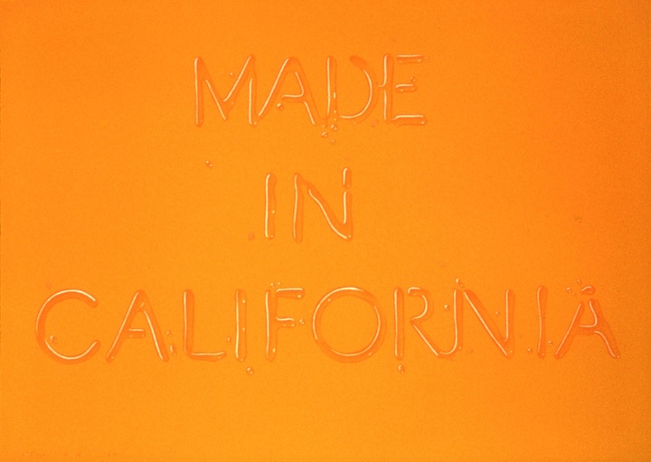
Ed Ruscha, Made in California, 1971, Three Colour Lithograph Print
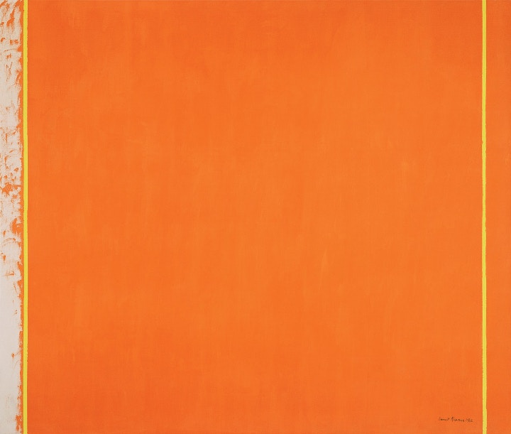
Barnett Newman, The Third, 1962, Oil on canvas

Mark Rothko, Ochre and Red on Red, 1962, Oil on canvas
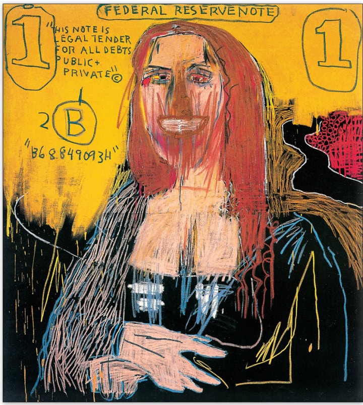
Jean-Michel Basquiat, Mona Lisa, 1983, Acrylic and Oil stick on canvas
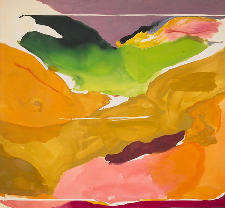
Helen Frankenthaler, Nature Abhors A Vacuum, 1973, Acrylic on canvas
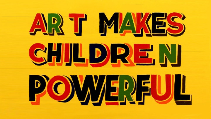
Bob and Roberta Smith, Art Makes Children Powerful, 2012, Enamel and household gloss on board

Michael Craig-Martin, Handcuffs, 2002, Acrylic on canvas
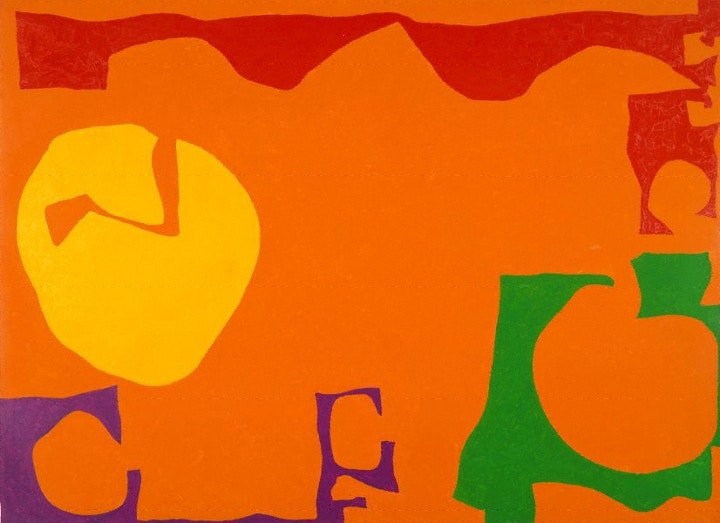
Patrick Heron, Big Rumbold Orange: December 1970, 1970, Oil on canvas
THE STORY OF THE CASS ART TOTE BAG
It all began with the original 'Art in a Bag' tote, which launched in store in 2008, when Mark Cass, CEO and Founder of Cass Art, and Pentagram Designer Angus Hyland, got together to give customers a sustainable way of carrying their art supplies home.
"The original 'Art in a Bag' is what the Cass Art tote bag is all about!" says Mark. "The idea was that once you've bought the tools you're already carrying the art home, ready to create it."

Over the years Cass Art has released several different coloured tote bags, and an additional black 'Art in a Bag' tote for our 30th Anniversary. Emblazoned with the colour names, the back of the bags then refer to the names of paintings that use that colour - for example, Ultra Marine blue was used in Kenneth Noland's Beyond.
This was to reinforce a palette that great artists have used throughout history - to remind us of our love of original paint colours.
"This is Cass Art's own frame of reference and we wanted to highlight the colours that Picasso and Lichtenstein had used," says Mark. "We wanted to remind customers that at the heart of everything we're in the colour business."


