Start: Typography with Romi Nicole Schneider
Posted by Cass Art on 29th Jan 2020
It's a commonly thought that graphic design can be done by anyone, but good graphic design takes a lot of time, focus and energy. Cass Art speak to Romi Nicole Schenider, third year graphic design student at Central Saint Martins, about what it takes to get started with graphic design, particularly typography and the turmoil of designing your own typeface.
Romi, can you tell us a bit about yourself and your practice?
I'm a final year student for BA graphic design at Central Saint Martins. I have a background in photography and enjoy all kinds of design, from typography and layouts to infographics and packaging design.
CSM is amazing in every way with such great opportunities such as live briefs with actual clients, the helpful tutors that are always around for when you need help, lectures held by different designers every week, events, and of course a huge library and facilities!
For the graphics people there's a group called TSI [typography special interest] which I'm a part of, lead by Phil Baines, so if you're into typography and you've never heard about him- start doing your research!
I see myself as a diverse graphic designer. My aim is to work with the music industry doing design as well as photography, something that I've already started doing, and traveling the world doing so.

How were you first introduced to graphic design? What was it that kept you keen on typography?
My dad works as a copywriter so I was always around the creative world, I'm more of a visual person so being around that I started doing photography which then lead me to do graphic design, as I realized that visually-appealing things attract my attention.
I first came to work with Type on my foundation year at Chelsea College of Arts. We had a brief to pick a line from a poem, and write it in 50 different ways using only one typeface. It was challenging but at the same time opened my mind to typography and the endless things you can do with it.
What are the essential materials for designers? What did you use to make your own typeface?
Graphic designers in general can get along with a pen and a sketchbook for starters. Then it depends what area the idea is going to.
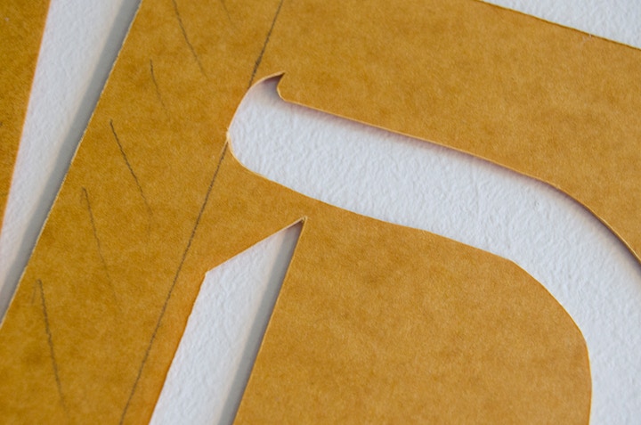
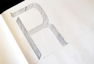
For the stencil I first used a pencil and a graph pad, you start by gathering and sketching ideas, later scaling it to size and refining it using the Faber-Castell pens, for this one I worked with the Fine one.
I then got a couple of stencil boards (available in the Cass Art stores), which are excellent for this purpose as the board is quite resistant for when you use your stencil with paint. Draw a baseline on all of them so you can know where to put each letter, it will make the job easier, a scalpel (Swann-Morton in particular is recommended as it's quite difficult to get perfect cuts with the stencil board so a good scalpel will make the job easier) and start laying out each letter drawing with the use of tape on the board, so it means cutting what you've drawn onto the board.
I'd recommend scanning or photocopying the drawings first to have as a reference. Once the letters are cut out and your fingers are sore, you can then try them out using a pencil or paint to see how they look like on paper. Even if it's not perfect there's a great feeling of success!

Where do you go to seek inspiration? What is your working process like?
Inspiration for me is not something I seek but just happen to find most of the time. I keep folders on my laptop for each type of design or things that I find interesting and inspiring. I get a lot of inspiration from being in crits and listening to my colleagues present their work.
I do a lot of research before starting anything. I note every small idea I have, I try to keep my notes visual, so I'll get into the visual mindset. It's important to experiment and try different ideas and mediums, even if they don't work they're great for hands-on research and reference. I happen to work better while stressed, so I might not be the best example but I do finish projects quite towards the end of a deadline.
For the typeface I made I decided to try and combine my first language Hebrew, with English, in a simple delicate way that won't make it look cheesy. I embraced the Hebrew serifs and took into consideration that some letters in Hebrew look like some other letters in English and tested out how it will look like, keeping in mind the typeface needs to be understood by English speakers and be easy to read.

Could you share your expert tips on how to become a design wizard?
I am still trying to find my way to becoming a design wizard, but I'd recommend staying true to yourself and what you're good at. If you believe in your idea, make it happen. We often get mixed feedback and it's a natural thing. Being a student is all about doing your own thing, experimenting, bringing your true design vision to the table. If you communicate your design good enough then you've done the job right.
Shop online now and be sure to follow Cass Art on Facebook and Twitter to keep up to date with all the latest art news, exhibitions and materials insight.


