Orange Lake Deep is the latest colour in our Cass Colour Stories. It is a deep orange shade, with its rich intensity and versatility, known for it's unique red/orange fiery hue has captivated artists and art enthusiasts alike for centuries. In this blog, we will explore the origins and properties of this unique colour with experimenting with a selection of mixing with its' complementary colour blue. Enjoy!
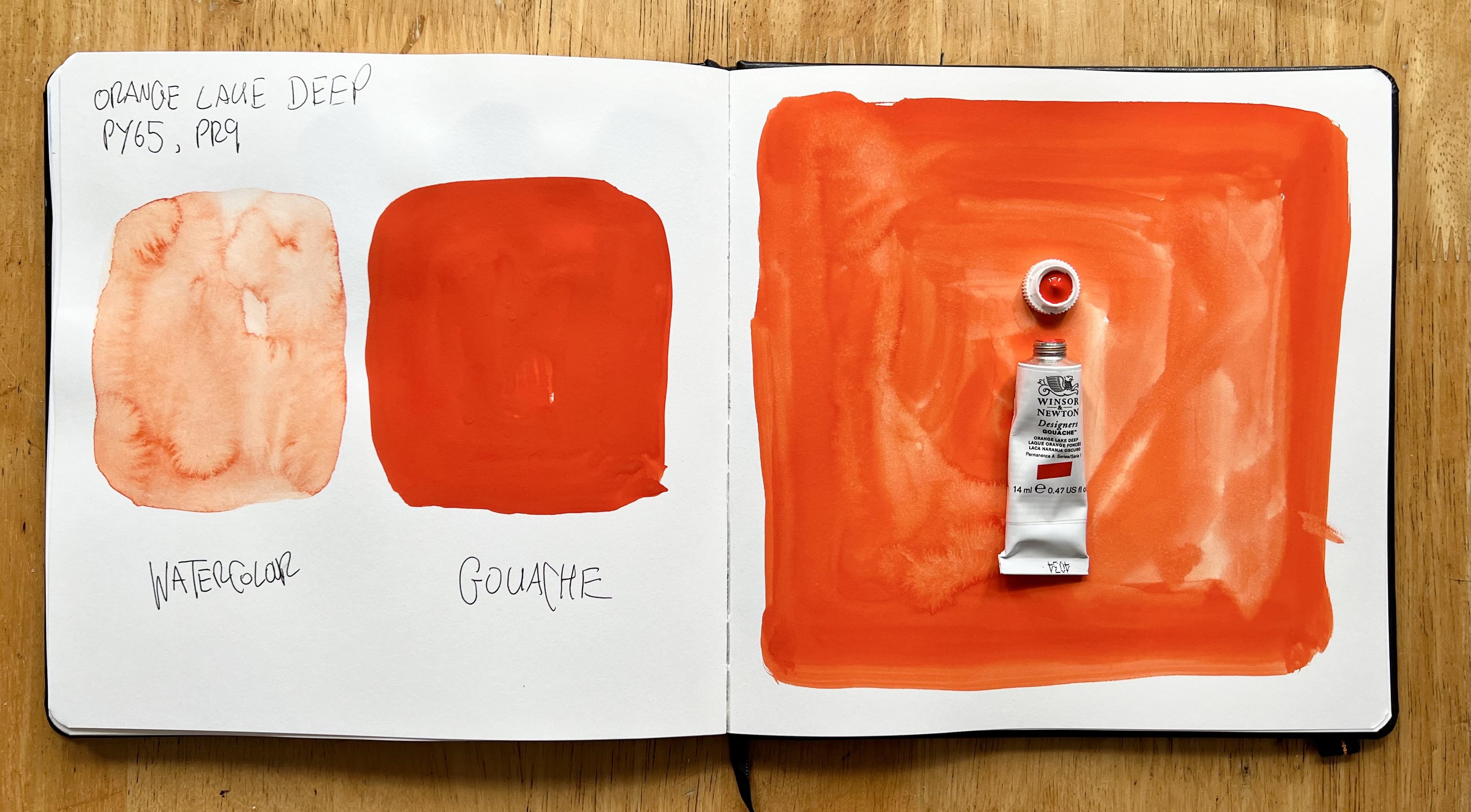
Permanence: Permanent
Lightfastness: II - Very Good
Opacity: Semi-Opaque
Series: 1
Pigment Codes: PR9 • PY65
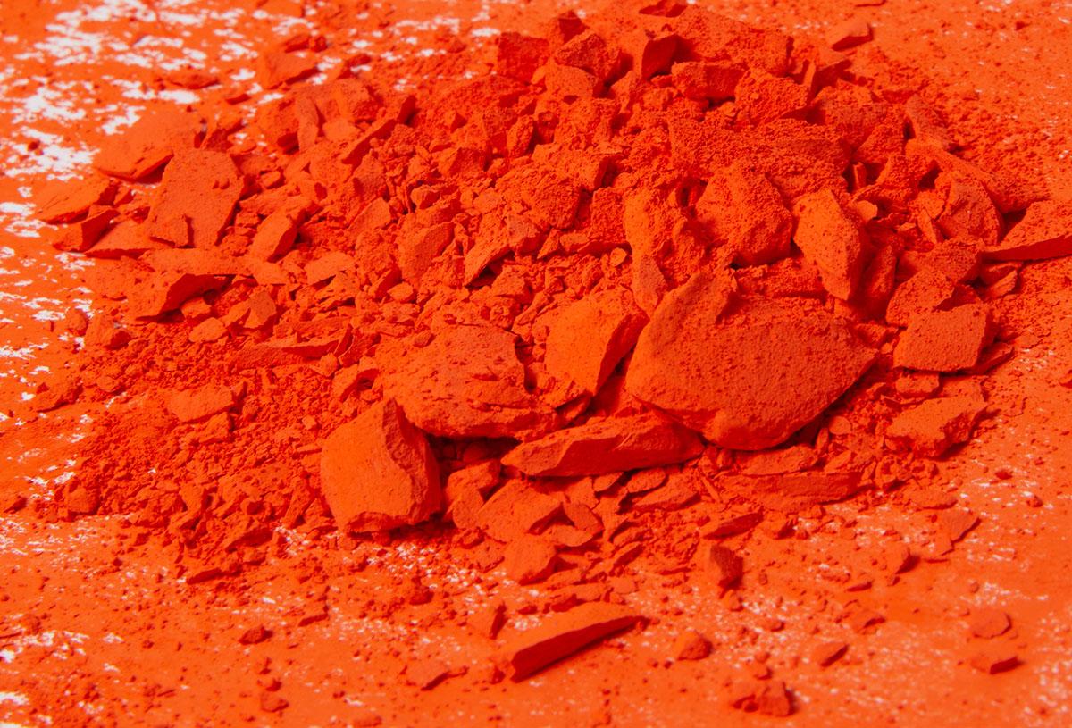
Orange Lake Deep is a synthetic organic pigment that belongs to the azo pigment family. Its vibrant hue is achieved by combining various organic compounds to create a stable and lightfast pigment.
The "Lake" in its name refers to the process of precipitating the pigment onto a colourless substrate, such as alumina hydrate. This process enhances the pigment's transparency and allows it to disperse more evenly, resulting in a vivid colour with excellent tinting strength.
One of the most distinctive features of this orange is its intense reddish-orange hue with a subtle hint of earthiness. This captivating colour is known for it's exceptional lightfastness, ensuring that artworks retain their brilliance for generations.
The pigment's high tinting strength means that even a small amount can significantly alter the tone of a colour mixture, making it a favourite among artists for creating striking highlights and glazing effects.
We’ve done some colour mixing with the complementary colour of orange which is blue, and chosen 2 different popular hues – Ultramarine Blue and Phthalo Blue.
Complementary colours are pairs of colours that are located opposite each other on the colour wheel. When placed next to each other, these colours create contrast and can make each other appear more vibrant and intense.
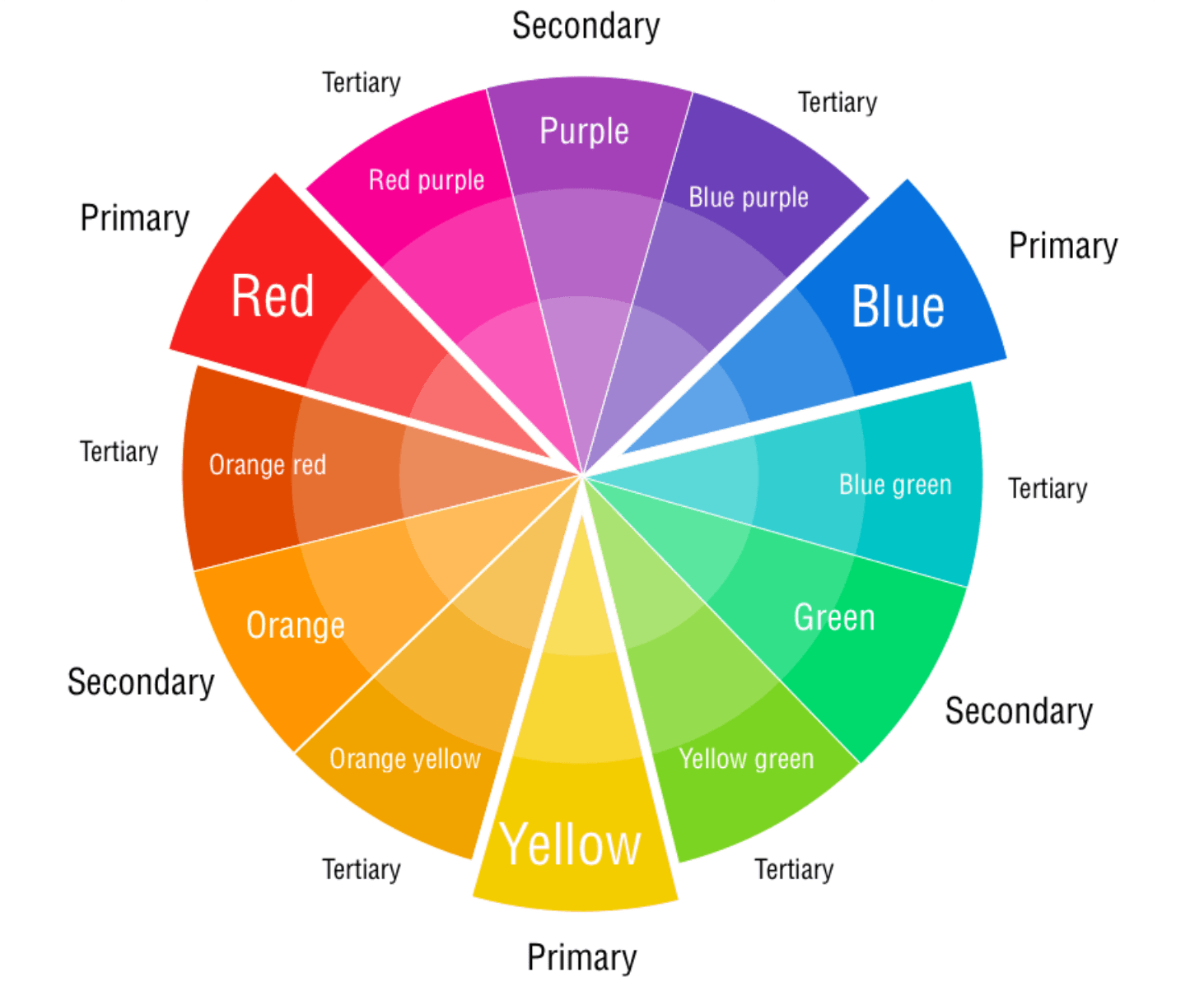
The primary complementary colour pairs are:
- Red and Green
- Yellow and Purple
- and of course Blue and Orange
Here's how you can use complementary colours in your works:
Create Visual Contrast: When you use complementary colours together in a painting, they create a strong visual contrast that can draw the viewer's attention. This contrast can make your artwork more dynamic and visually engaging.
Colour Balance: Theycan be used to create a balanced and harmonious composition. You can use one colour as the dominant hue and its complement as an accent to create a focal point.
Warmth or Coolness: They can also be used to emphasise the warm or cool aspects of your artwork. For instance, using blue and orange can make a painting feel cooler, while red and green can create a warmer atmosphere.
Limited Colour Palette: Working with a limited colour palette can be challenging but rewarding. Using complementary colours as the basis of your palette can result in a cohesive and visually pleasing painting.
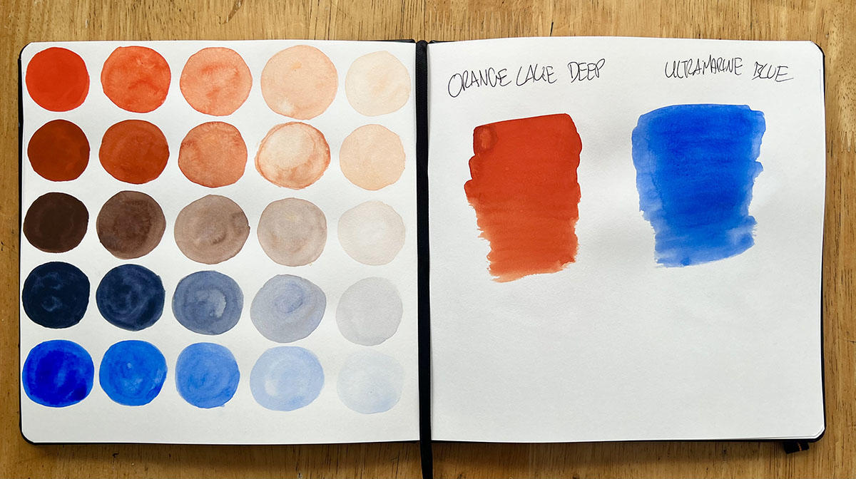
As we know our hero colour Orange Lake Deep is a warm hue, while Ultramarine Blue is a cool blue. When you mix these two complementary colours they tend to neutralise each other and create a range of colours that are closer to greys or browns. The resulting colour will likely be a muted and desaturated version of both the original orange and blue.
As you gradulally increase the Ultramarine, but orange is still the more dominant mixture you create a series of brownish hues, then as you Ultramarine becomes more prominant the results will be more on the cool greyish/navy side bordering on Davys Grey almost.
The mixture may exhibit interesting undertones. For example, with Orange Lake Deep which has a slight red hue and the Ultramarine Blue leans towards a greenish hue, you might notice very subtle red-green undertones in the resulting mixture in the above example.
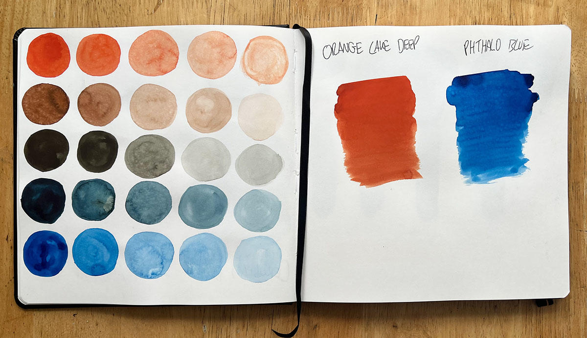
Just like with mixing Orange Lake Deep and Ultramarine Blue, when you mix with Phthalo Blue in equal proportions, you will get a neutral greys but with a slighty different undertone.
Initially as you add small amounts of Phthalo Blue to Orange Lake Deep, you'll achieve a dark, deep earthly orange colour with subtle hints of blue undertones. The more the blue modifies the orange, it makes it a bit more subdued. As you gradually increase blue to the mixture as you can see above you achieve a beautifully muted green greyish colour and in some cases borders on on a teal hue as you have a greater amount of blue in the mixture. This is mainly down to Phtahlo blue being an intense highly saturated pigment.
As always, colour mixing is a subjective and creative process, and the results can vary depending on the specific brands and colours you use. Don't hesitate to experiment and explore to find unique and exciting colour combinations that suit your artists palette!


