Michael Harding Artists' Oil Colours have a long history of excellence since 1982. They are renowned for their superior quality and craftsmanship. Free from fillers, extenders, or driers, painters can expect a rich, buttery, brilliant colours with excellent lightfastness and a with a texture that's silky rather than oily. Numerous world-renowned painters, including David Hockney, Chris Ofili, and Sir Howard Hodgkin, have endorsed this product.
To celebrate 40 years of trading Michael has announced that over the coming year he will be adding an extra 40 brand new colours to his oil paint range. The first release is the Tunbridge Wells Selection which comprises 10 colours and is named after the town in which Michael Harding first started producing oil colours in. We were delighted to speak to Michael about his latest new launch, why he chose these colours and what makes them so unique.

Hi Michael thanks so much for taking the time to speak to us. Can you tell us about the inspiration behind these 10 new oil colours? Were there specific artistic needs you were trying to address, or colour gaps you identified in the existing range?
Thank you for the question on why I created the new colours. There were serval reasons why I created 10 new colours:
- Over the years certain colours had been asked for that I was not making such as Cadmium Green.
- Along with artists requests for specific new colours with more lightfastness, for example the Benzimidazolone range and certain shades of Quinacridones.
In addition, when I stood back and looked at my oil paint stand, I felt there were obvious gaps in the spectrum we offered.
· The big inspiration for me was creating my new watercolour line and falling in love with the new pigments I brought in house. Knowing I had some gaps and oil painters wanted more I started playing with formulations with some of the beautiful pigment I am now using in my watercolours.
· The eye candy made me think about the number of years I have been in business, which is now over 40 and so I thought, what a terrific way for me to celebrate 40+ years of business by coming out with 40 new oil colours!

Developing new oil colours requires a delicate balance between vibrancy, handling, and permanence. Can you walk us through the process of formulating these new oil colours? What kind of performance characteristics can artists expect from them?
From my point of view as a paint maker I don’t want to sound blasé, but this is the type of challenge I thrive upon. For me, I delight in balancing the oil content with the dry pigment content in a way to achieve a wonderful texture and creamy nature. The colour decision has already been made it is just a question of finding a way to enhance it.


Only pigments of suitable lightfastness were considered for the 40 new oil colours. There is one exception, Opera Rose. I added it for pure eccentricity because it is so vibrant and fluorescent. However, its lightfastness is about the same as an Alizarin Crimson. To put it simply a colour must be interesting to be considered. This includes vibrancy. Artists can expect a similar performance that they are akin to with my products. I leave out the fillers, driers, etc. leaving the pigment to stand on its own. Intense, vibrant, saturated, and beautiful.
Creating and launching a new line of oil colours is no small feat. Were there any particular challenges you faced during this process? How did you overcome them?
The challenges I faced were, thankfully, minimal, challenges to me are opportunities. Having made paints for nearly 50 years, as I got started on my own when I was an art student, I have the good fortune of seeing challenges as a delight. Formulating and creating the new colours was invigorating for me. The most daunting part of the process is waiting for the toxicologists to test and certify all my new colours, which I am delighted to share, all my new colours are fully certified.


These 40 new colours will offer a vast palette for exploration. Can you offer some advice to artists on how to best approach mixing and experimenting with these new additions?
There are two ways to go about mixing and experimenting with my new oils:
· One can dive straight in and perhaps acquire a set of all 10. Then create painting with just the 10 new colours.
· An artist can select one or two new colours at a time and integrate them into their existing palette.
What most artist do is squeeze one or two Michael Harding colours out at a time and mix with a bit of Titanium White to see which way the new colour leans. It has always been my observation for some reason that artists invariably smell a new colour to see if they like it. Of course, with my oils you will get a very distinct linseed oil smell as my paints are all solvent free!


Ⓥ VEGAN
With excellent lightfastness and a smooth consistency, Turner’s Yellow (No. 235) radiates warmth and saturation—perfect for adding a pop of colour to compositions. Though there is some debate as to which W. Turner is associated with the original colour and its patent,
This yellow hue is a stunning colour with an abundance of uses, sitting among Michael Harding Naples yellows and variety of ochres.
Series No. 2
Colour Index: PY216
Drying Speed: Average
Transparency: Opaque
Lightfastness: Excellent
Oil Content: Low
Tint Power: Average
Toxicity: Non-Toxic
ASTM D-4236: ✔

Ⓥ VEGAN
Brilliant Orange (No. 246) is a bold colour, radiating warmth and vitality. Its semi-opaque quality adds depth, while excellent lightfastness ensures long-lasting vibrancy. With an average drying speed and smooth consistency bound with linseed oil, it’s perfect for creating dynamic compositions that capture the intensity of a fiery sunset or the vibrant hues of autumn foliage.
Series No. 2
Colour Index: PO62
Drying Speed: Average
Transparency: Semi-Transparent
Lightfastness: Excellent
Oil Content: High
Tint Power: Average
Toxicity:Non-Toxic
ASTM D-4236: ✔

Ⓥ VEGAN
Rose Dore (No. 319) is a robust yet subtle colour, blending pigments PY151 and PV19 to evoke the soft, romantic tones of a golden rose. With excellent lightfastness and a semi-transparent quality, it adds depth to every composition. Featuring a slow drying speed and bound with linseed oil, No. 319 empowers the artist’s detailing and layering.
Colour Index: PY151, PV19
Drying Speed: Slow
Transparency: Semi-Transparent
Lightfastness: Excellent
Oil Content: High
Tint Power: Average
Toxicity:Non-Toxic
ASTM D-4236: ✔
Ⓥ VEGAN
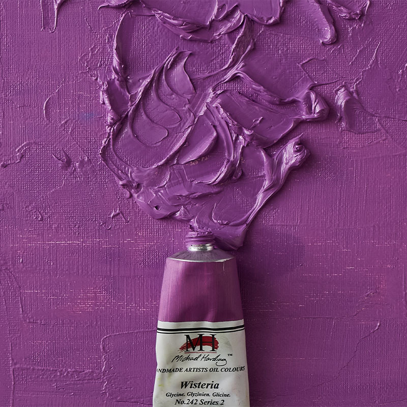
Wisteria (No. 242) is a soft, pastel colour falling into the useful category of pale colours made for just about any application, from landscape to completely non-figurative. Vivid and powerful, No. 242 is a handy addition to every artist’s palette.
Series No. 2
Colour Index: PW6, PR122, PB29
Drying Speed: Average
Transparency: Opaque
Lightfastness: Excellent
Oil Content: Low
Tint Power: Average
Toxicity: Non-Toxic
ASTM D-4236: ✔

Ⓥ VEGAN
Another versatile, high-coverage, natural colours, Lavender (No. 243) is useful in myriad applications.
Series No.2
Colour Index: PW6, PB29, PV15
Drying Speed: Slow
Transparency: Opaque
Lightfastness: Excellent
Oil Content: Low
Tint Power: Average
Toxicity: Non-Toxic
ASTM D-4236: ✔

Ⓥ VEGAN
Vivid Blue (No. 240), as its name suggests, commands attention with its intense brilliance and boldness. Offering excellent lightfastness and a smooth consistency, No. 240 is perfect for creating dynamic compositions inspired by the sky or ocean.
Series No.2
Colour Index: PW6, PB15.3, PG7
Drying Speed: Average
Transparency: Opaque
Lightfastness: Excellent
Oil Content: Low
Tint Power: Average
Toxicity: Non-Toxic
ASTM D-4236: ✔

Ⓥ VEGAN
Phthalocyanine Blue Red Shade (No. 231) captivates with its deep, rich colour. Offering excellent lightfastness and a fast-drying speed, it’s ideal for creating bold, vibrant artworks. No. 231 is a red shade blue, or, put another way, a slightly violet blue with the high tinting power the artist expects of ‘thalo’ colours. Some describe it as nocturne in a tube.
Series No.2
Colour Index: PB15.1
Drying Speed: Fast
Transparency: Transparent
Lightfastness: Excellent
Oil Content: High
Tint Power: High
Toxicity: Non-Toxic
ASTM D-4236: ✔

Ⓥ VEGAN
Cadmium Green (No. 412) is a vivid colour created from pigments PY35 and PG18. With excellent lightfastness and opaque transparency, it adds depth to compositions. Its average drying speed and linseed oil binder make it a versatile choice for artists seeking reliability and vibrancy in their work.
Series No.4
Colour Index: PY35, PG18
Drying Speed: Average
Transparency: Opaque
Lightfastness: Excellent
Oil Content: High
Tint Power: Low
Toxicity: Non-Toxic
ASTM D-4236: ✔

Ⓥ VEGAN
With its earthy tones, Moss Green (No. 239) captures the serene beauty of nature. Featuring excellent lightfastness and a semi-transparent quality, No. 239 adds depth and dimension to artworks inspirational for natural landscapes.
Series No.2
Colour Index: PY150, PB29, PR209
Drying Speed: Average
Transparency: Semi-Transparent
Lightfastness: Excellent
Oil Content: High
Tint Power: High
Toxicity: Non-Toxic
ASTM D-4236: ✔

Ⓥ VEGAN
Neutral Grey N7 (No. 140) is designed to be to assist artists with tonal values. A lean colour with a relatively low oil content, Neutral Grey N7 is useful as a base ground colour with high covering power. For the more experienced artist, Neutral Grey N7 is a workhorse grey that can be tinted into.
Series No. 1
Colour Index: PW6, PBr6, PBk6
Drying Speed: Average
Transparency: Opaque
Lightfastness: Excellent
Oil Content: Low
Tint Power: High
Toxicity: Non-Toxic
ASTM D-4236: ✔
Add To List
Add a Wishlist
form to add wishlist here