Cass Art is thrilled to announce the launch of Michael Harding's stunning new 10 colours which feature in his newest set entitled the "Brick Lane Collection," named after the location where he first started mass producing oil colours. As part of this exciting release and also to also celebrate our 40th year we're also proud to present two exclusive sets, each showcasing a unique palette of hues. In this blog we're going to focus on one of his most vibrant releases to date - Opera Rose
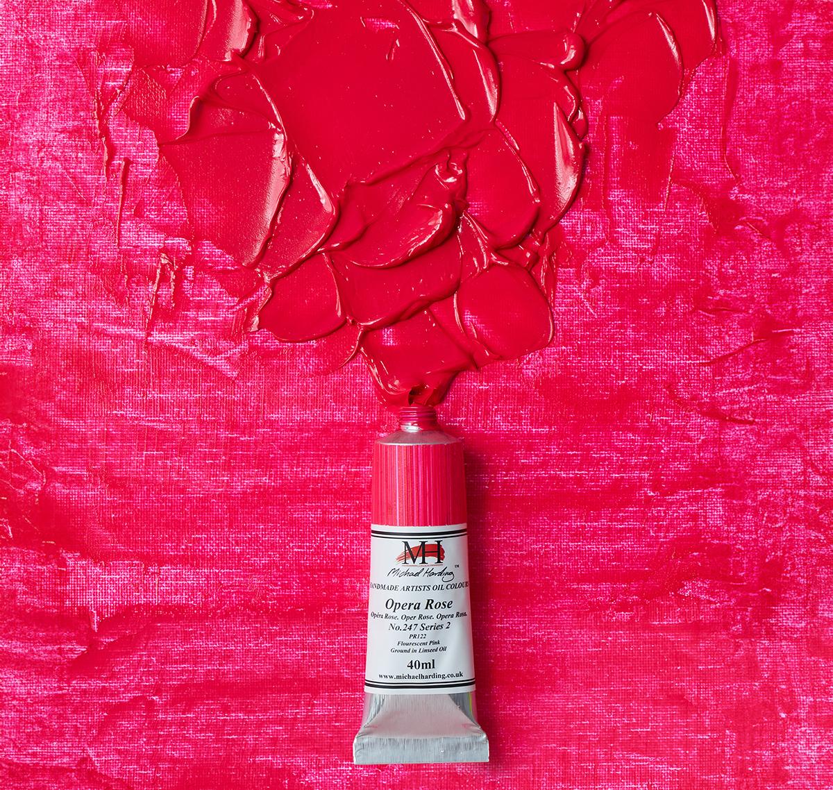
Opera Rose is a vibrant and intense pink colour that is primarily popular among watercolour artists. It was first introduced by the American company, Grumbacher, in the 1970s. It's made from a blend of pigments that includes Quinacridone, a synthetic organic compound that produces bright and vivid hues. It is a non-toxic, and transparent paint that is ideal for creating bold and eye-catching paintings.
Series number: 2
Pigement no. PR122
Chemical description: Fluorescent dye/resin based pigment
Lightfastness: Fugitive
Drying Time: Average
Permanence rating: B
Transparency/Opacity: Transparent
Oil Content: High
Tinting Power: Average

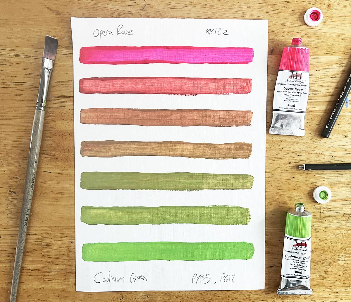
The colour pink is often associated with love, compassion, and tenderness. However, Opera Rose, with its deeper tone, can evoke a sense of warmth, passion, and intensity. It can add a touch of drama and emotion to your artwork, drawing the viewer's attention. One thing you'll notice with the below colour studies when you mix Opera Rose with a little bit of another colour, it does immediately change due to Opera Rose being a transparent colour.

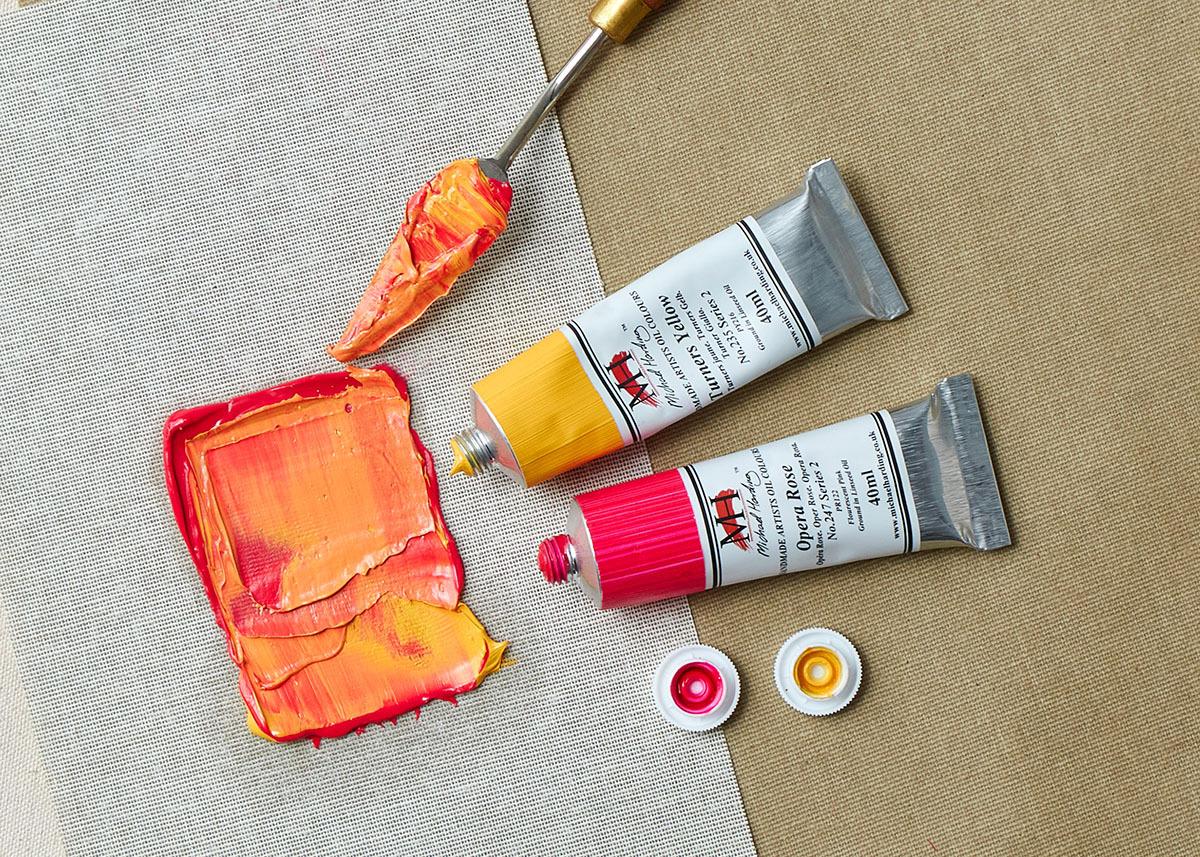
Adding a small amount of Turner's Yellow to Opera Rose creates a vibrant orange with a touch of pink, an almost peach hue. As you gradually add more Yellow, the orange becomes brighter and more intense, with the pink undertones gradually fading. The addition of Turner's Yellow shifts the colour temperature towards warmer tones, creating a range of yellows.

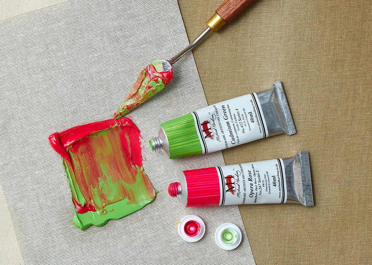
Adding a small amount of Cadmium Green to Opera Rose initially gives you a red tone similar to Carmine. As you gradually increase the amounts of green it creates more muted, earthy brown with a hint of pink. The more you increase the the brown becomes deeper and more intense, with the pink undertones gradually fading.
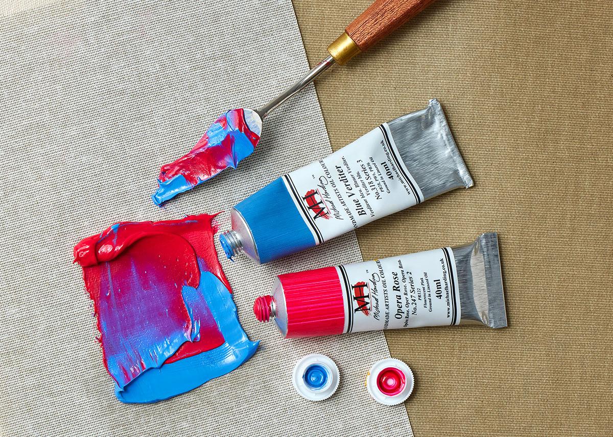
The combination of Opera Rose and Blue Verditer creates a beautiful interplay of colours. As blue is gradually added to the vibrant pink of Opera Rose, the initial pink hue begins to soften, taking on a more muted and complex lavender tone. This purple is not a harsh or vibrant shade, but rather a soft, muted version that adds depth and complexity to the overall colour without overpowering the original pink. It's as if a whisper of purple is hidden beneath the surface, subtly influencing the overall appearance. The resulting colour is a harmonious blend of pink, blue, and a touch of purple.

Opera Rose is a truly versatile pigment that can be used to create a wide range of colours. By experimenting with different colour combinations and varying the proportions of each pigment, you can discover the endless possibilities of this hue. Whether you're looking for a muted neutral, a vibrant orange, or a deep, rich pink, Opera Rose has the potential to enhance your artwork.
Add To List
Add a Wishlist
form to add wishlist here