Hi Bethany, firstly a massive congratulations of being named Posca’s artist of the year! What an amazing achievement! What was that moment like when you heard?
Thank you so much! It was unbelievable. I was at work and had been on edge for the past week or so. I was up against some amazing talent, so I really didn’t think I was going to win – It was truly anyone’s game. I found out mid shift, surrounded by my team. This did mean that anyone who went near our posca unit was told for the rest of the shift (and still now) which made it quite an amusing day too!
Now let’s go back to the start and you work is based around architecture, what was it about this subject that compelled you to depict?
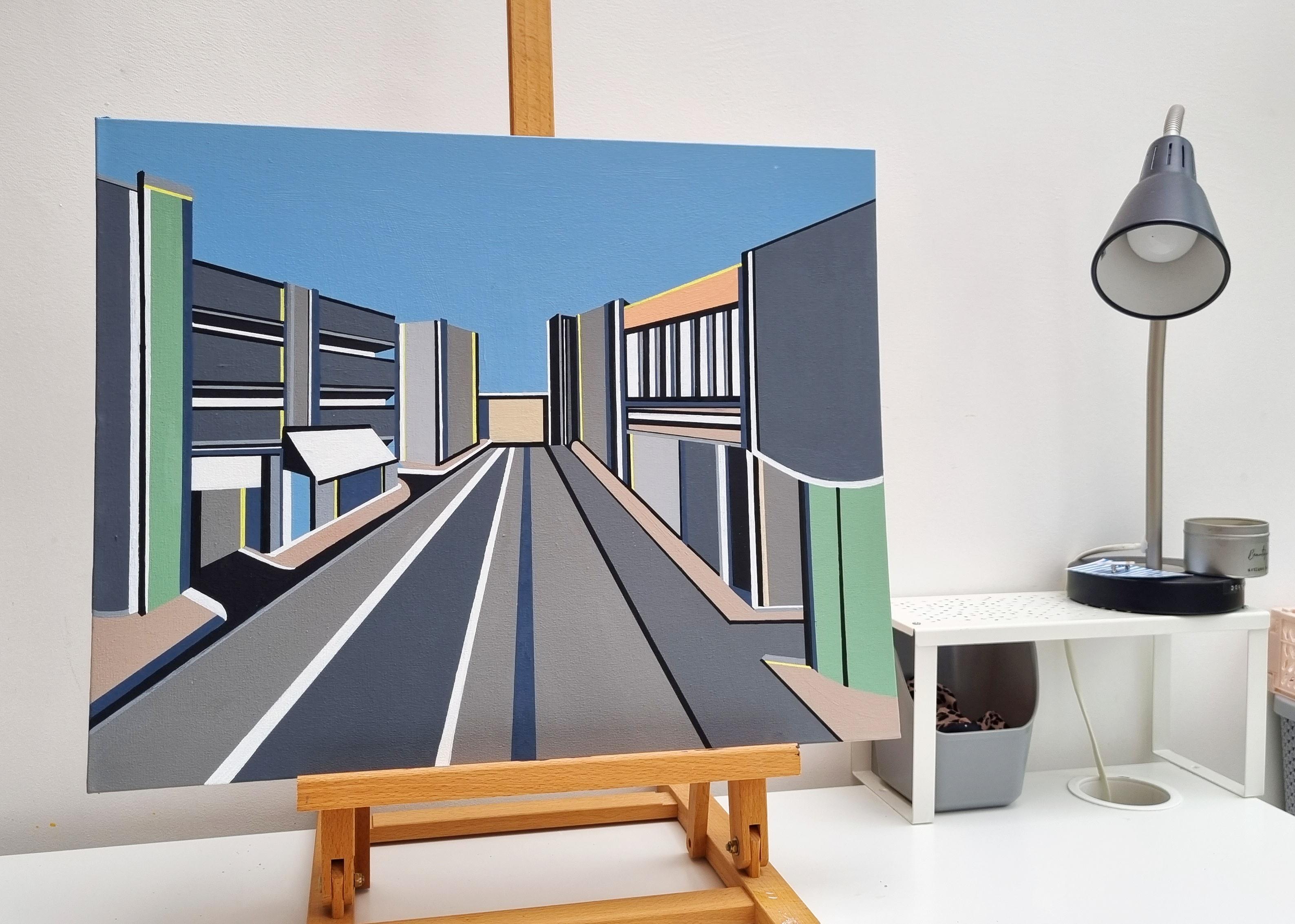
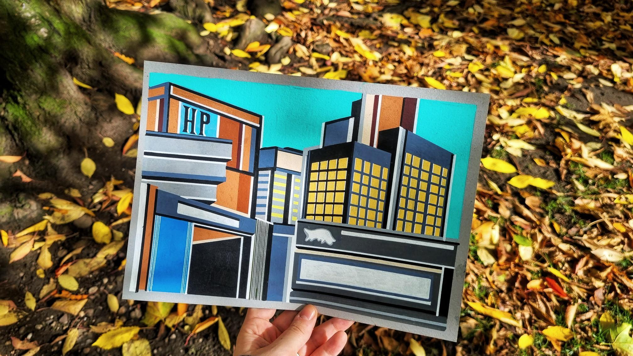
My first time I remember taking an interest in architecture was an old Royal Mail Building and Carpark not too far into Hall Green, I believe. I remember still thinking of it as an adult, trying to remember where it was so I could draw it. I should have known then that Brutalism was the next step in my love of architecture. Shapes, colours, and emotions also play a huge part of my love of Architecture. My work follows quite closely to Psychogeography (the effect of locations on emotions) so I have always had links with certain buildings. Birmingham Central Library, The Barbican Centre in London and Rotunda (Birmingham City Centre) are perfect examples of buildings that I obsess over and draw often due to having an emotional link to them.
More specifically what is it about Brutalist architecture is it that you’re drawn to?
Whenever someone asks me this question, it’s always the same answer – the sense of community. Brutalism was needed in the UK. We were fresh out of our second war in 30 years, and we were in desperate need of housing. Think tower blocks, libraries, and schools all built in a specific style because it was cheaper and simplified.
Housing was built around social aspects (laundry rooms) so that when tenants crossed paths, they would be able to have some sort of social meeting. Finally, after years of isolation and genuinely not being able to talk to strangers we had ways of socialising, even when completing mundane every day tasks. One of my favourite Architects once said that brutalism was “a play between crudity and finesse” and I think Corbusier nailed it on the head. Hard on the eyes, easy on the heart.
One thing about your work is uniquely easily identifiable as a Bethany Dartnell, could you talk us through how you developed this unique aesthetic?
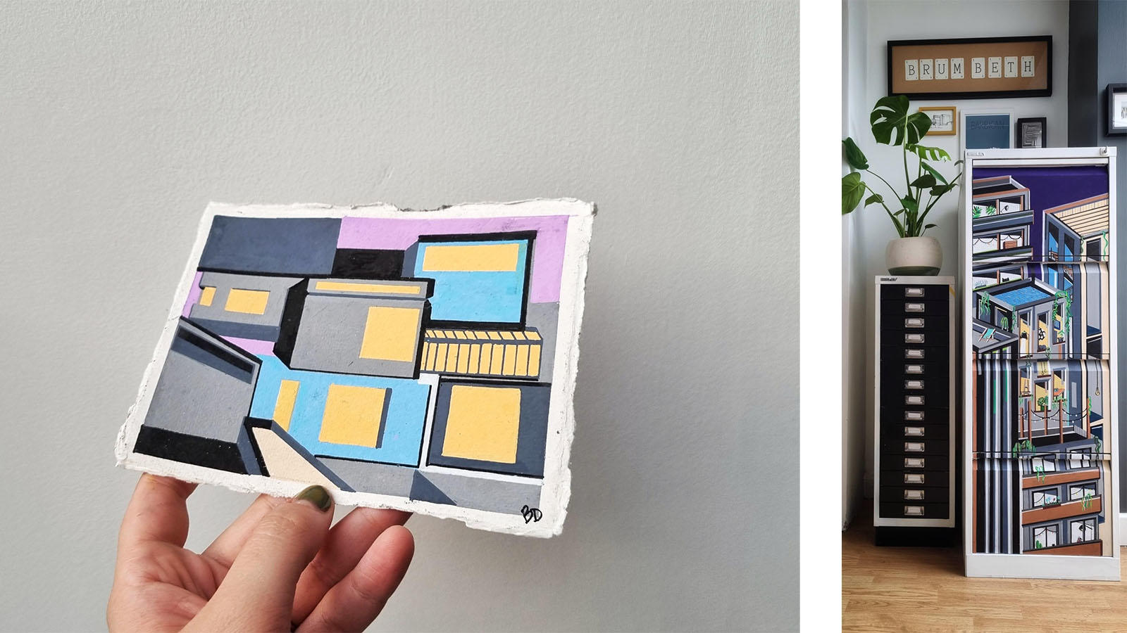
Five years ago, there was no colour in my work. Black, White, and Grey only. When lockdown came along, it was an excuse to finally play around and push my practice to include what I was scared of. Combining soft colours with the harsh lines of Brutalism.
Brutalism is 9 times out of 10 classed as ugly and is often not received well. However, I then get told ‘You have made that building look beautiful’ which is a great compliment even when I think they are beautiful to start with. Now I cannot imagine colour not being in my work, even when I switch to watercolours, colour is still a huge part of my practice.
Obviously Posca is your go to! What is it about them that you love?
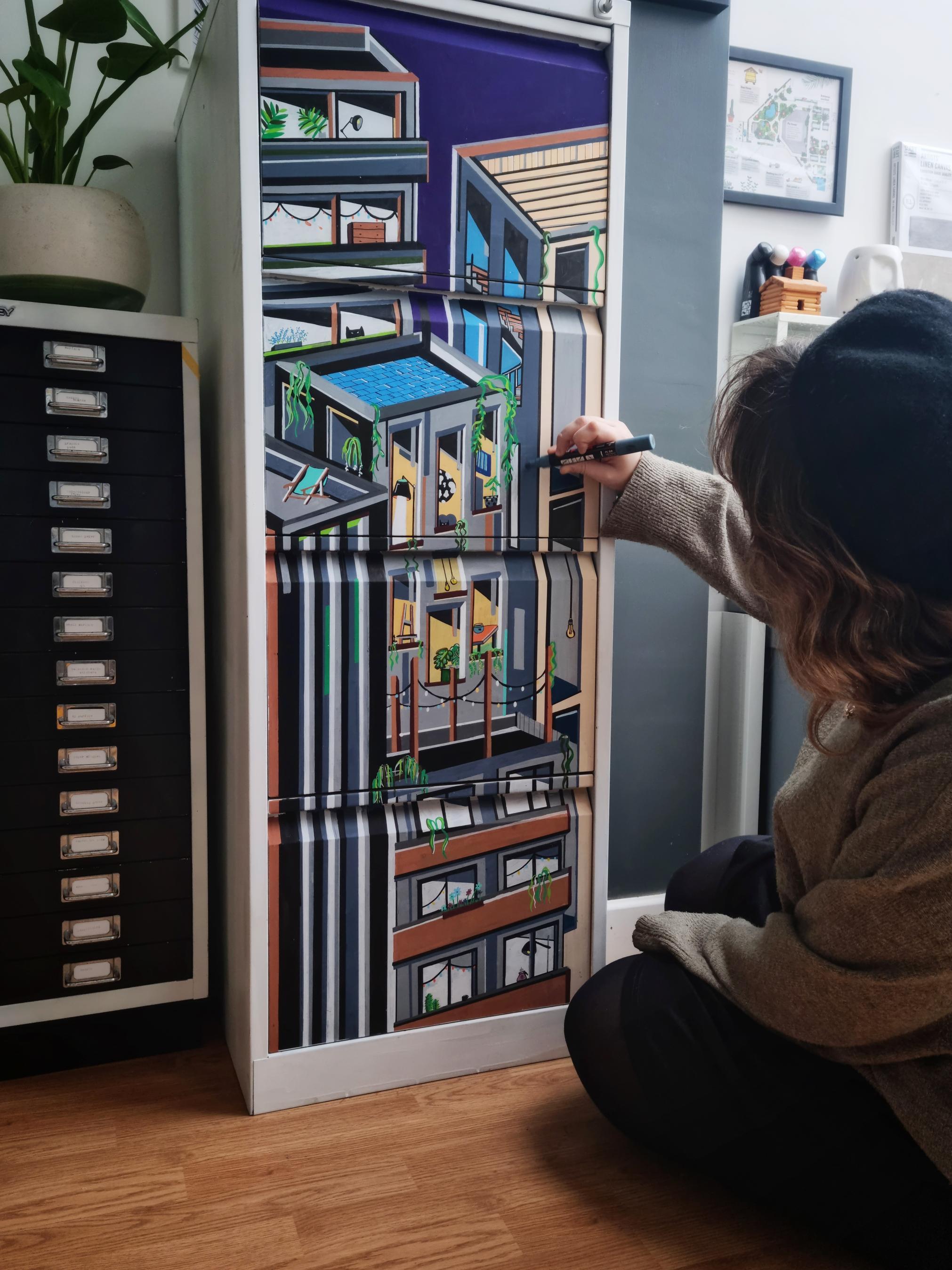
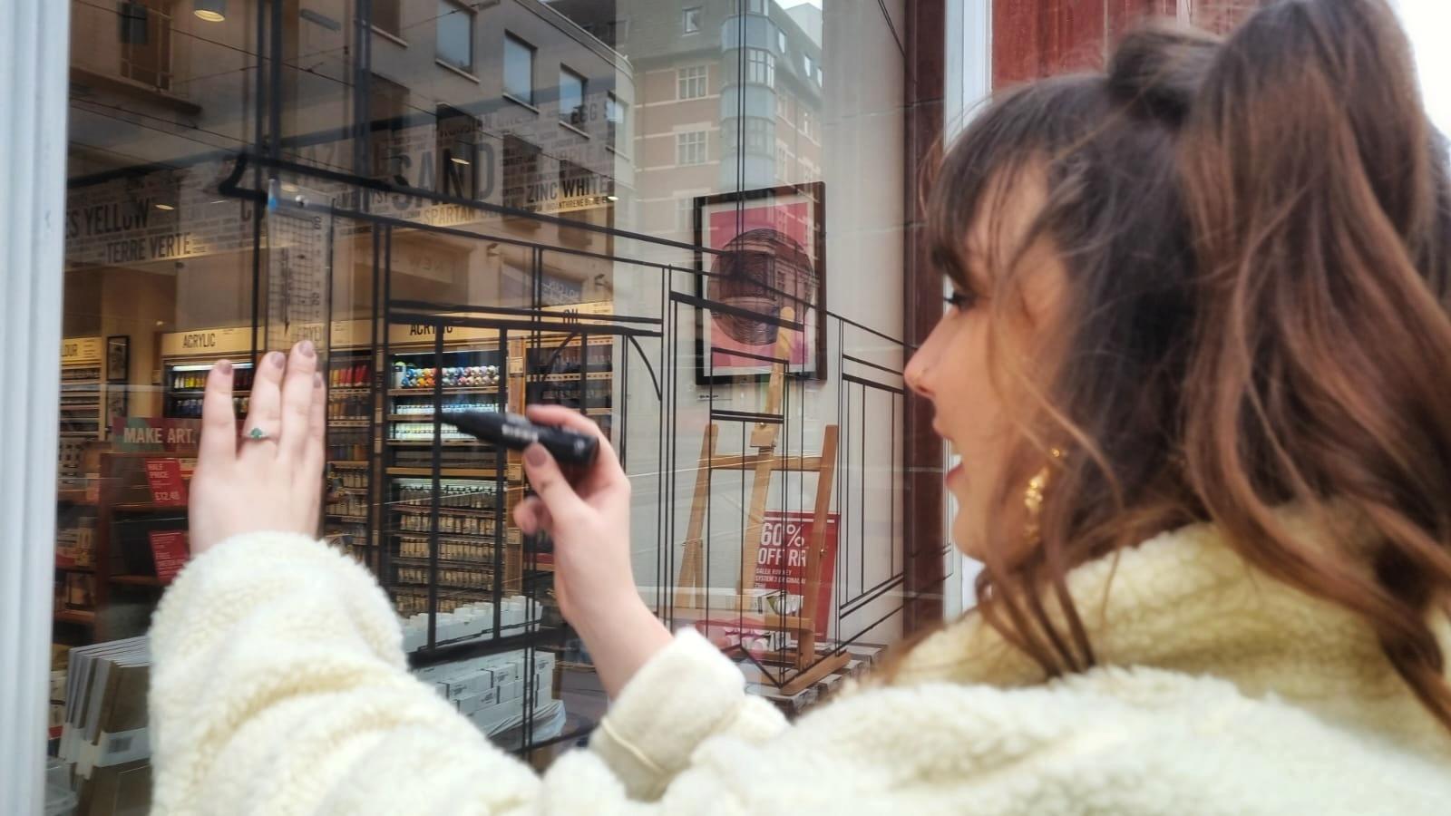
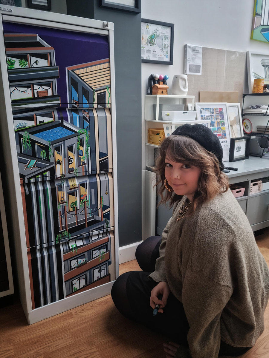
They are probably the most flexible item in my artist toolbox. I have yet to find a surface they don’t enjoy working on. From glass window murals, canvas paintings to filing cabinets – they work on everything. They easily layer up too, which makes working on larger scale just as easy as small. When we sell them at work, its quite easy to say they will never be disappointed in the product. One last thing that I love is the amount of colour choice, especially now as we delve into the new packs (Posca Deep has become a staple for me).
Just on the subject of materials, if we were to wonder into your studio are there any other materials that we would find that you particularly like?
Surface is my thing. I love Khadi, which is a handmade cotton rag paper from India. I would probably say 70% of my work is done on that, as I have a draw dedicated to it in my studio. I normally paint on it with Liquitex Acrylic Gouache and then layer and add the details with Posca. That is my go too. However, when I am not feeling as bold, I tend to lean towards watercolour, again on Khadi. I have also got a sketchers box of watercolours I’ve had since I was around 11, that now houses a very specific muted palette of Greens, blues, greys and browns. Green Gold, Potters Pink & Payne’s Grey might be the best colours I could name from it.
On that note, we’re always interested in artist studio habits that allows them to access that sense of creative flow. Do you have any studio habits that helps you (and excuse the cliché!) start a blank canvas?
When I read this question out loud, 3 people responded straight away with Tea, lots of tea. Which is true as my studio is in the conservatory next to the kitchen so numerous cups of tea to get me through any painting process is needed. Note books and storage too, as I’m naturally quite a chaotic person so I need some way of making sure its organised chaos. Things tend to be size ordered or labelled a lot.
I luckily have quite the collection of supplies over the many years of working at Cass Art and practicing so I am able to reach for what I need quite easily. Lastly, comfortable clothes. Nothing better than a cosy outfit, slippers, and a blanket or two to get me through painting in the winter. All this helps me stay quite productive, most of the time.
Finally, what’s on the cards for 2023 now you’re Posca Artist of the Year!
To keep working on a larger scale. The piece for the final was one of the largest things I have ever worked on, and probably the most illustrative (as we had to include no huge references to pop culture, so it was designed by me). I love the idea of continuing to upcycle things, larger canvas work and even some customisations. I have an old pair of Dr Martens which are just waiting to be brought back to life.