Among the vibrant hues that have enchanted artists and designers throughout history, the colour orange holds a unique place. Its warm and radiant nature has found its way into countless masterpieces, evoking emotions and adding that ‘zest’ to visual compositions. We wanted to look at the fascinating history of orange pigment and its significance in various cultures and art movements to modern interpretations of what emotion this hue can evoke.
The story of orange pigments begins in the natural world. In prehistoric times, humans used various sources to create orange hues, such as iron oxides and minerals like ochre. The actual name “orange” was only given to the colour in the 16th century — it was called “saffron” or “yellow-red” previously.
This changed when orange trees were brought to Europe from Asia by Portuguese merchants. The colour was then named after the ripe fruit, which carries through many different languages. Orange in English, naranja in Spanish, arancia in Italian, and laranja in Portuguese.
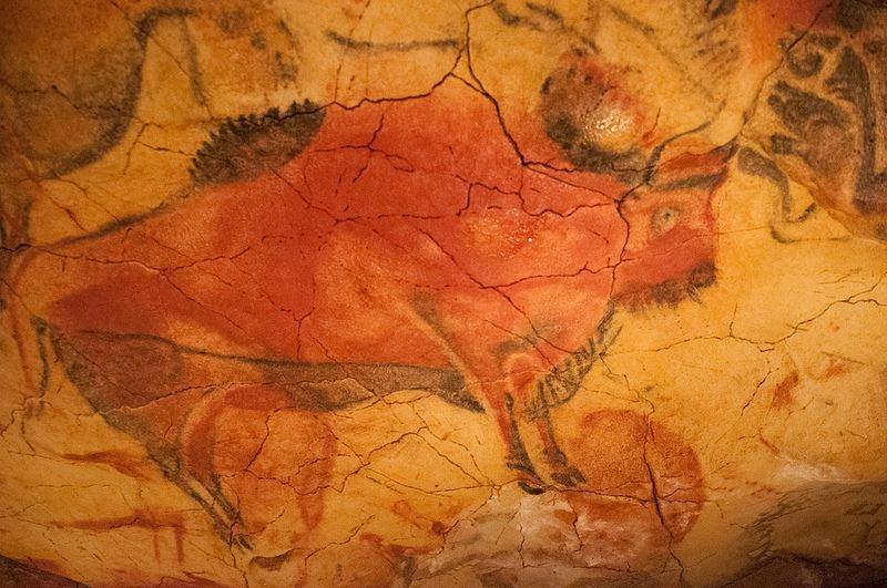
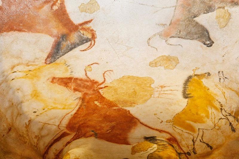
These pigments, readily available in nature, were used in cave paintings which you can see below with images from the Lascaux Caves in South-Western France. Ancient civilisations, including the Egyptians and Mayans would extract yellow-orange shades from earth minerals like ochres, clay, and limonite, which were abundant and readily available in the earth's crust. These early pigments were not only used for artistic expression but also held cultural and spiritual significance in these ancient societies.
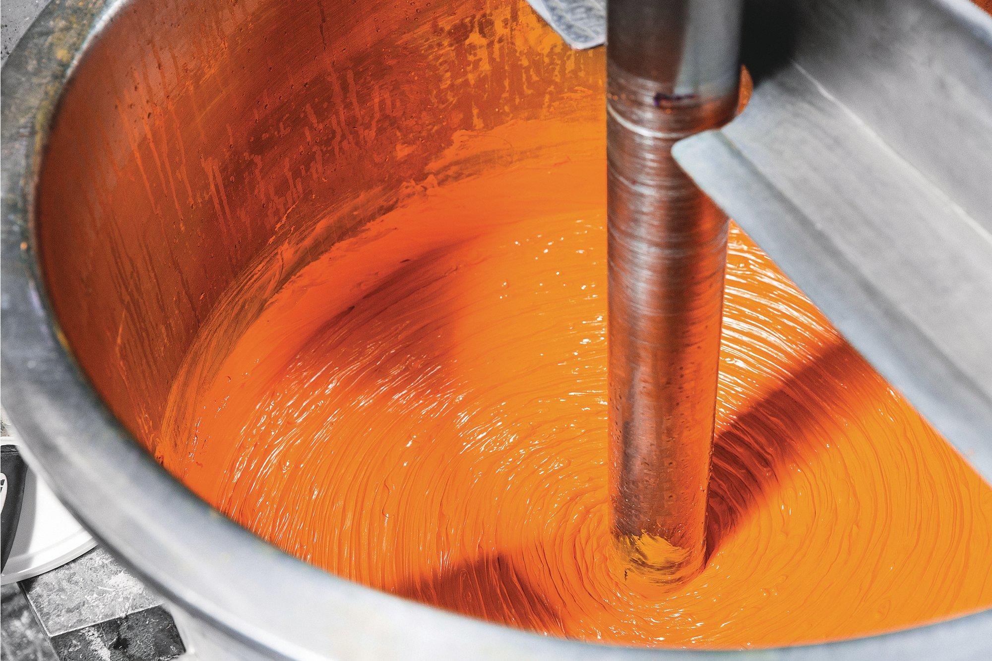
There became a desire for more diverse and stable orange pigments and in the 18th century, scientists and artists embarked on a quest to develop new synthetic pigments, free from the limitations of natural sources. One of the breakthroughs during this time was the discovery of lead-tin yellow, a vibrant orange-yellow pigment that became popular among European artists.
The next big turning point in its history would occur in 1809. This marked the creation of the first fully synthetic orange pigment – Chrome Orange. Some of the world’s greatest artists leveraged this new tool to create their most breathtaking works. Renoir and Monet are notable examples. However, Vincent van Gogh is particularly notable for his ability to use orange to create emotionally moving and almost dreamlike works.
In the 20th century, a new era of orange pigments emerged with the discovery of Cadmium-based colours. Cadmium Orange offered artists a brilliant, opaque hue with excellent lightfastness.
With advancements in organic chemistry, new orange pigments were introduced. One such pigment is Pyrrole Orange, a vivid, translucent colour widely used in various artistic mediums. Its lightfastness and versatility have made it a popular choice for artists seeking a contemporary orange hue.

Orange pigments continue to inspire artists today, contributing to a wide range of artistic expressions. From the bold, fiery strokes of Vincent van Gogh's "The Starry Night" to the harmonious blending of warm and cool tones in Claude Monet's "Impression, Sunrise," orange pigments have left an indelible mark on the art world. We look at two of the most unique uses of orange by
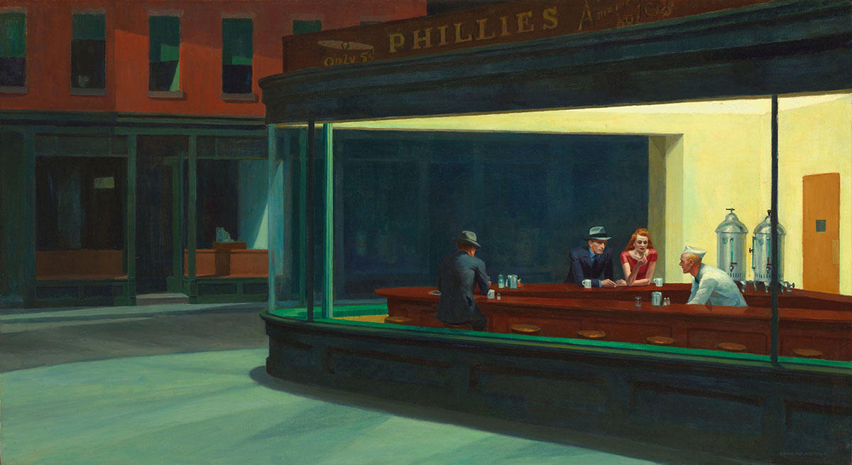
"Nighthawks" by Edward Hopper
In "Nighthawks" by Edward Hopper, the use of orange plays a significant role in creating the atmosphere and mood of the painting. While the predominant colour scheme in the artwork is a deep blue, the strategic placement of orange adds contrast and visual intrigue to the composition. In this work the interior of the diner is bathed in warm, artificial light, which is where the orange hues come into play. Hopper used Cadmium Orange to represent the glow emanating from the light fixtures within the establishment.
The orange light serves multiple purposes in the painting. Firstly, it creates a sense of intimacy and comfort, inviting viewers to step into the scene and imagine themselves as part of the nocturnal atmosphere. The warm glow of the light gives the impression of a cosy and welcoming interior, contrasting with the darkness outside.
Nighthawks
Edward Hopper
School of the Art Institute of Chicago
This use of orange contributes to the overall atmosphere, focal points, and visual balance of the painting. It helps to create a sense of warmth and intimacy within the diner while also drawing attention to specific areas of the composition.
'Three Studies for Figures at the Base of a Crucifixion' by Francis Bacon
In this triptych, Bacon presents a distorted and nightmarish portrayal of three figures situated at the base of a crucifixion, each in their own panel. The figures are depicted with elongated limbs, contorted bodies, and grotesque facial expressions. Within this unsettling composition, he strategically employs this hue to accentuate specific elements and heighten the overall emotional impact.
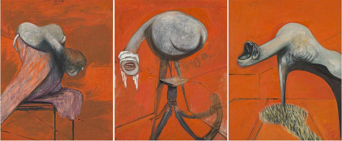
'Three Studies for Figures at the Base of a Crucifixion'
Francis Bacon
Tate Britain
One of the notable uses of orange in the painting is in the background of the central figure. The orange hue creates a vivid contrast against the darker surrounding colours, drawing attention to the figure's twisted and tormented form. The intense orange serves to heighten the sense of anguish and agony experienced by the central figure, intensifying the overall emotional charge of the composition.
The use of orange in this work contributes to the overall atmosphere of despair, violence, and existential anguish that Bacon sought to convey. It adds a jarring visual element that amplifies the psychological and emotional impact of the painting.
As we know orange is a combination of red and yellow. Red is filled with energy and stimulation, and yellow is responsible for the happiness and cheerfulness. It is a more active colour because it makes us react by gut feeling, and we feel at that particular moment.
It is the colour that gives you shelter in though moments, by not allowing you to sink into grief or disappointment. It brings a high degree of positivism, always rejuvenating us in the most difficult moments. The great and invigorating benefits of the orange colour should be used every day, even if it is just a small object, like a mug or a pen, which we use in our daily tasks.
Orange is also a very social colour, making people open up and enhance their communication. It is a very inviting colour, so it is great if is used as a decorative colour for parties, as it gets people talking and inspires a good mood. To make a dinner with family, or with friends, more pleasant, use lighter shades of orange to decorate the table or surroundings. If you didn’t know, pastel orange shades would increase the appetite. So you will end up having a great time eating, drinking and talking. Thus, it isn’t the best choice of colour for your kitchen if you are trying to go on a diet.
From ancient cave paintings to modern masterpieces, the history of orange pigment has witnessed an fascinating evolution. Across civilisations and time periods, this hue has symbolised everything from divinity and royalty to warmth and creativity.
Add To List
Add a Wishlist
form to add wishlist here