Artist’s mural at Cass Art Islington supported by Winsor & Newton using Professional Watercolours; Venetian Red, Terre Verte, Magnesium Brown, Cobalt Violet, Cobalt turquoises and Lemon Yellow Deep
What is the idea behind your mural?
The mural is a visual dialogue on the materiality and colour offered by these six colours in Watercolour. Watercolour is not normally associated with large scale murals but it has enormous potential for the artist with its transparency and texture offering insights into the individual characteristics of each pigment. I was excited at the possibility of working on a large scale again; I like the physical tension of things beings just out of reach so that you have to really consider your intentions and what you are going to next.
The dialogue that occurs between the marks, the colours the texture, takes me into new directions and decisions. Exploring line, where it starts and ends, the edges and the relationship to one another. I was constantly looking for relationships between each of the colours and the space between. In my early work I worked predominantly on a large scale in oil and encaustic. I wanted to do this piece inspired by the long history of mural painting and frescoes, the history of colour making from Cennini to George Field and more recently the Pigment Timeline by Jo Volley (2014).
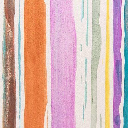
Each of these colours is distinct and beautiful in their own right, but when mixed with each other, provide possibilties to the palette. This mural seeks to show the potential of these 6 colours which, when mixed together, create a range of colours tints and tones. I wanted to work with a restricted palette, making informed responses to the colour as I worked with it. I am interested in colour theories and what colour means in different cultures and contexts but also how colours have evolved throughout history. We are extremely fortunate to have access to such a broad palette and better understanding of pigments and dyes archives such as Winsor and Newtons offer an insight into the history of colour making and what it means to the artist.
What colours were used to create the piece?
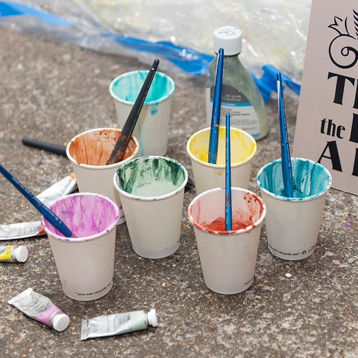
It is based on 6 beautiful historic colours; Venetian red, Terre Verte, Magnesium brown, cobalt violet, Lemon yellow deep and the Cobalt Turquoises. Each colour has its own interesting history and contemporary use by artists.
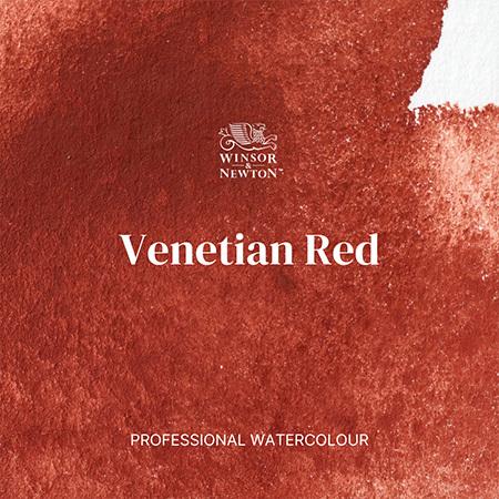
Venetian Red
Venetian Red is an earth pigment used by Titian. It is a rich opaque deep red colour, called Venetian Red after the quarry near Venice. Now a Synthetic Iron Oxide Red, it is more consistent in both colour and texture.

Terre Verte
Also an earth colour, used in painting since the Romans. A green ochre with a bluish grey green, I love its beautiful delicate transparent green seen in frescoes and early Italian painting. When layered and used in underpainting it offers subtle cool tones and beautiful greys when mixed with its complimentary red. Brice Marden’s Grove Group paintings really brought the beauty and breadth of this incredible colour.
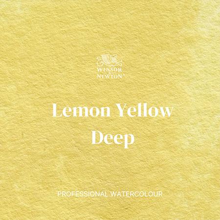
Lemon Yellow Deep
George Field the colour maker who worked with Winsor and Newton, introduced Lemon Yellow as a colour name when creating yellow alternatives to the arsenic-based yellows from orpiment. They sought to create colour where possible, from single pigments that were lightfast and permanent, recognising the importance of this for the artist. I was drawn to the deepness of the shade of lemon, it provides a subtlety in tone and being naturally granular adds texture when added to other colours.
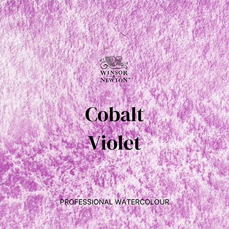
Cobalt Violet
This was one of the first colours I ever purchased, outside of my core cool and warm primary palette. This single pigment violet, naturally super granular, was first created in 1859. I loved seeing it for the first time in Monet’s Waterlilies 1916. The National Gallery explains that his core palette altered and included Cobalt Violet. Like many artists at that time, he was concerned about lightfastness and discolouration that can occur by the combined use of some colours. He carefully selected his palette to avoid this, choosing single pigments knowing the extensive control and expansion of the palette an artist has when working with single pigment colours.
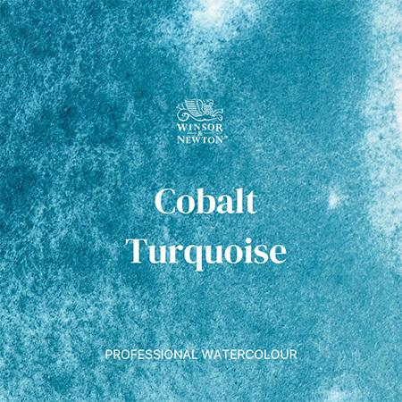
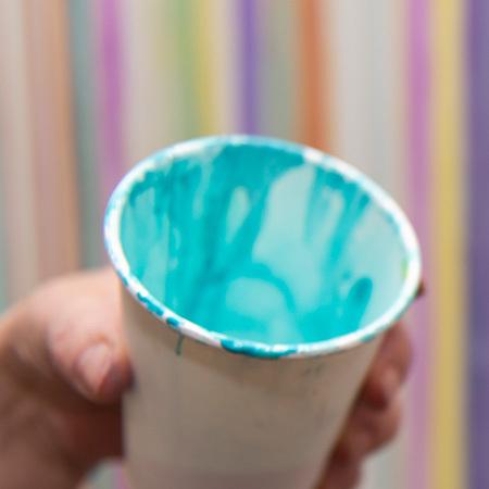
Cobalt Turquoise
I was fascinated to discover, when researching Wilhelm Ostwalds Colour and Science; that had been translated in 1931 by J Scott Taylor, Winsor & Newton’s Scientific Director, identifying turquoise as a core colour to the palette. He draws attention to the fact that turquoise is not seen enough in nature for us to recognise this fact. These semi opaque granular turquoises are bright and beautiful but when mixed with other colours create incredible violets, greens and greys.

Magnesium Brown
Magnesium Brown is an opaque synthetic orange-brown colour which leans towards the warmer side of the colour spectrum. It's a relatively modern pigment developed in the 19th century. Similar to a rich, burnt sienna but with a touch more citrusy orange peeking through.
What was the creative process and production?
The order and method of the colour application began with the colours individually. This revealed their individual intensity and provided the basis for the piece. I then wanted to explore how the palette extended as the colours were mixed together.
By first mixing two colours together each time; Lemon Yellow Deep, Cobalt Turquoise and Cobalt Violet to develop brilliant bright violets, greens and oranges, offered more subtle opportunities when adding Magnesium Brown, Venetian red and Terre Verte. The final stage of the piece combined complementary colour opportunities which led the palette to an array of chromatic greys.
I used masking fluid to draw with in order to create spaces for each of the colours. Masking fluid was a new medium for me. It has a reputation for ruining brushes and have tried it in the past with pipettes or syringes, however, I discovered that if you lather your brush with soap first it protects the hairs entirely from the fluid. You can then rinse it easily after use. I drew across the space working in both directions vertically, not wanting to let it become random but respond to the formality of the composition as it evolved. I used synthetic squirrel and sable brushes to have the control I needed to paint and mix the colour, as they can hold a lot of colour when working on such a large scale.
What is your relationship with Cass?
When I was a student, first at Camberwell school of art, now part of the UAL; I would go to the Cass store in Charing Cross road to buy my materials. I have welcomed the opportunity over the years to use the other Cass stores as they opened, depending on where I was living and working at the time.
"My history with Cass Art has been since the first store in Charing Cross Road opened and going there with my mother. I remember being excited because my great aunt had bought me a Winsor & Newton watercolour box for my birthday which I really wanted. It was the big present."
I have also really enjoyed being involved in the Big Walls and Windows project, a brilliant collaboration between Cass, the UAL and Liquitex. A chance to provide a platform and support for emerging artists to work ambitiously on a large scale, which is exactly how a student experience should be. The chance to be bold and try something new.
Feeling inspired to create your own big masterpiece?
We've got everything you need to be creative.
Add To List
Add a Wishlist
form to add wishlist here